Saturday, June 29, 2013

How Technology Affects Human? (Final Project)

The improvement and development of technology has significantly enhanced our lives. It has led to a way easier, better and comfortable life for the people. The rise of technology has improved our daily lives in various ways. One of the significant examples is the advancement of business communication. In this competitive era of borderless business, technologies brought the easiness. Today’s business is entirely dependent on communication where technology plays a very important role. These technologies have become necessity that assisted us to be efficient in global business. With an uprising number of companies exploiting technologies in inventive ways, many companies have been adopting a CTO (Chief Technology Officer) to their executive leadership teams. Various technological tools are being used in today’s business communication. More and more tools are being introduced each day such as internet, teleconference, voicemail, instant messenger and email. All these tools have efficiently enhanced business communication in distinct ways. 

Step ONE:

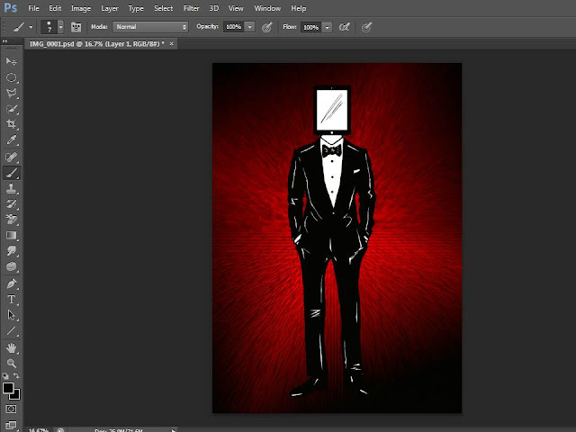
Draw on a piece of A4 size paper. Scan it into the computer with a resolution of 300 pixels and resize the picture into an A2 size using photoshop.


Step TWO:

Start off by coloring the drawing and be precise on every little detail.


Step THREE:

Then, using black and red with gradient tool (select diamond gradient) to create a background.


Step FOUR:

Go to Filter > Stylize > Extrude (Pyramids) to add on effect to the background


Step FIVE:

Cut and paste the drawing on to the background using quick selection tool.


Step SIX:

Draw additional drawings to make the message clearer and scan it into the computer using the same settings


Step SEVEN:

Color the additional drawings


Step EIGHT:

Cut and paste the additional drawings to the primary file. Drag the 'Apps' to make them look like they are being sucked into the background.


Step NINE:

Additional effect to the background.

Filter > Stylize > Tiles, Number of tiles: 10.


 FINAL ARTWORK: 


Artist Statement:

I portrayed a business man by drawing a man in tuxedo and a briefcase at the side. The man in tuxedo looks formal and successful. Ipad is a media convergence. The man in tuxedo had an Ipad as his face. People nowadays rely on technology all the time. With an Ipad as the man's face is where I perceivd a person who faces and rely too much on Ipad where his face eventually became an 'Ipad face'. On the other side, the apps that surrounding the business man are apps that were most commonly used by a business man. Apps such as shareplus, dropbox, skype, email, etc have brought much convenience to a business man. For example, a dropbox allows a person to immediately share an important file to a person or skype can be used to have a video conference with the clients as well. This artwork aims to show how technology assisted human in a business communication world and how human is attached to technology that it became an essential part of their lives. 

References:
http://tnark.org/2012/08/29/how-technology-has-affected-our-everyday-lives/
http://www.slideshare.net/Rayan1989/uses-of-technology-in-business-communication

The sketches of my rough ideas: 

Business man with "Ipad face"


Global Communication

Perception of Beauty

Transformation of Buildings

Evolution of Toys

How Medical Technologies Save Lives


Monday, June 17, 2013

Pop Art


Here's a Pop Art of my own picture using photoshop skills learned from 

Reference: http://www.melissaevans.com/tutorials/pop-art-inspired-by-lichtenstein


Friday, June 14, 2013

Photo Montage


Photo Montage is a kind of collage that is composed primarily of photographs or fragments of photographs in order to direct the viewer's mind toward specific connections.


Here is my first photo montage exercise. The Stitch is admiring the beautiful and sexy looking Megan Fox while picnicking by the beach. I sort of reuse what our lecturer has taught us today such as how to put a picture on another picture, burn, adjustment of contrast, saturation and more.

Definition reference: http://arthistory.about.com/od/glossary_p/a/p_photomontage.htm
Picture reference:
http://akelhawa.com/wp-content/uploads/2008/09/megan-fox-bikini-gq-07.jpg
http://th08.deviantart.net/fs71/PRE/i/2011/141/d/6/stitch_by_karkajou1993-d3gw7hd.png
http://image.made-in-china.com/2f0j00IKSacdLMEYkW/EVA-Slipper.jpg
https://blogger.googleusercontent.com/img/b/R29vZ2xl/AVvXsEgy5klY4XpRQN9axmXeGTiZHMZJHERkGJxdRImfjzYYiJ8WY-kSJVUY0-jf5QAh68lPqrMkW9h5LWYgLApLjGtYlkyF3fWBFbxpFkHQ2xNNTZDgddm4cxLn_FgKbu4l_nslI2iqd8c0kDg/s640/Coconut+Water.jpg
http://www.elkspringsresort.com/gatlinburg_cabins_blog/wp-content/uploads/2012/04/gatlinburg-picnic.jpg
http://www.hdwallpapers.in/walls/tree_beach_side-wide.jpg

Thursday, June 13, 2013

Typeface


A typeface is a design for a set of printer or display fonts, each for a set of characters, in a number of specific sizes. 

Here is a typeface design of my name, Carmen Too. The car as the background is symbolizing my name - CARmen and the green wheel represents my surname's second 'O', Too. I'd like my design to be simple this time as too complicated designs or background will drag away the attention from my typeface.

The typeface is required to be drawn on a graph paper.
The reason why our lecturer gave us graph papers to draw on this time is to keep our design in proportion. 


Reference: http://whatis.techtarget.com/definition/typeface

Wednesday, June 12, 2013

Visiting the National Art Gallery!


This is my very first time here. I came here with few of my friends since we couldn't make it last Saturday. Apparently the National Art Gallery has changed its name to National Visual Arts Gallery, according to the security guard there as we thought we got to the the wrong place! We are not allowed to snap photo of the paintings, however we have been told by the receptionists that we could take pictures around the lobby.


Before we enter the building, we have to take the escalator up and the entrance is right up there.

As we go up, there were collages of paintings as the wallpaper at the side of the escalators. This has already triggered my excitement and curiosity about how does it looks like in the building.

When we stepped in through the entrance, I was immediately attracted by the painting behind the reception counter. It was a long horizontal painting with a man surrounded with helicopters. It was a very colorful painting and I think it fits really well with the interior design of the hall.

After we signed our names at the book placed at the reception counter, we immediately step into the very first floor of the National Art Gallery.


Reception counter
Happy Garden by Chang Yoong Chia

There are three floors in this building. To me, the first floor is my favorite, The very first painting that attracted my attention was a oil paint named 'Happy Garden' by the artist Chang Yoong Chia. This painting is very interesting and it sort of reminds me of the story Alice in the Wonderland. In the middle of the painting there is a very huge rabbit sitting on the floor of a living room in the house with babies rabbit at the stomach area, which i guess they are drinking milk from the mother rabbit. The reason why I think that it was a living room is because there are pictures hanging on the wall which is what a family usually does- hanging family members' pictures on the wall of their living room. Right behind the giant rabbit, there is a tower with many small houses and ladders connecting each floors. There are small little humans walking outside the house, and some are climbing up the tower to a higher level using the ladders. The painting was painted that the size of things and creatures were totally the opposite of what we usually see in reality. The rabbit is actually bigger than the houses and humans! Besides, on the left hand side, there is a giant ant, which is just slightly shorter than the tower of houses. It was a really big ant. The ant wasn't crawling but standing up instead with the other four legs up as if those were it's hands. Furthermore, there is an elephant with a human body sitting right in a tree branch, with his right palm facing out. It looks like a Hindu God to me as it has a 'dot' on it's forehead. The surrounding in the house became like a forest and a man is standing there with his facial expression which looked like he was shocked by what is happening in the house. The man is touching the giant rabbit's body and at the same time with the other hand pushing against the wall. His body gestures showed that he was really shocked and amazed at the same time. Then, beside the man, there is a lady holding a giant goldfish as the goldfish is almost as equivalent as half of her body and the size of the lady is somewhat smaller compared to the man. There is also an egg on a nest, it feels like it is Easter as there are egg and rabbits! Little humans are walking and chilling happily around the forest-liked surrounding.There is another man and lady at the entrance of the living room and their sizes are different from each other which looks like they are shrinking to the size of the little humans around. We'll never know when is the man who touches the rabbit's turn.

Someone Forgotten (Dream & Reality) by Wong Woan Lee

This painting shows a room with 3 sections of rooms as the front view. An old man was lying on a thin mattress on the floor, staring blankly on the ceiling, with a family photo laying beside him. He is wearing a shorts and topless, the ribs of him were shown and that shows that he is at the stage of old age and left with nothing. I can see that he is thinking of someone, which is most probably his family. In the first section of the room (most right hand side), there shows the old man staring at his past, where he is watching the television with  his wife and grandchildren. In front of the second section of the room (middle), there shows the old man sitting down on the floor with his both hands placed on his head, looking down, feeling disappointed. In the room there shows four of the same old man, one is that he is lying on the floor, staring at the ceiling blankly, and another two is that he is staring at the wall without a piece of his mind and the last 'him' is holding a lollipop while staring at it. From this we can tell that he misses his family very much and the wife may be already passed away, leaving him alone in the house as the children already formed their own family, living on their own. There is a window in this section of room where his children is staring at him outside the window without taking any actions after seeing their fathers' loneliness. Lastly, at the third section of the room, it shows that the old man is giving his grand daughters lollipop, but his grand daughters did not accept it but staring at him looking confused as the old man reach out his hand to give them the lollipop. I doubt the grandchildren even recognize who the old man is. The sad story of the man being abandoned and left alone was all seen through his eyes. He is staring at the ceiling hopelessly and lifelessly. He is just living without a life.

This painting tells me how forgetful and ignorant is the younger generation nowadays. As our parents get old in the future, we as the children should take care of them, give them love just like how they did when we were young. However, not many people could even do this. As we can see in the present, many old parents were sent to the old folks home as the children claimed that they have no time to take care of them. They create excuses just to avoid the responsibilities. Their parents had eventually became someone that is forgotten. Sometimes old people living on their own would loved to have their children and grandchildren paying them visits more often. They dream to see their beloved children and grand children. However, the reality is children who would visit their parents often became so rare that most of the them are just taking things for granted and ignore the effort of visiting their parents by giving excuses. Due to the irresponsible act of the children, the younger generation which is the children's children would observe everything and eventually behave exactly like them in the future when they grow up. Therefore, the younger generation should be taught since young so that this kind of sad scenes would not happen anymore.

We must love our parents endlessly and never ever leave any one of them behind. 

As we continue to explore the building and this is what we have found:


There are children learning how to paint here at second floor

The children's painting

We found this beautiful painting at the staircase exit
This was found at the exit too.
Family series - Mother & Child by Rosli Zakari


THE END
Love Art, Appreciate Art

Design Principles and Design Elements Application


This is my drawing using design principles and design elements that I have learnt in class. Lines and shapes like triangles were my design's main elements. Besides, I used black and brown color as the shading of my tree's bottom in order to create tone and tree branch's texture. Then, I used various colors and repetition of triangles. I left some of the triangles blank and some with patterns to create a balance to my design. 

The idea of my tree design came from a spark of inspiration from the texture of a tree. I was thinking of creating a tree that had never existed in this world. This drawing shows a normal tree that started to evolve slowly from the bottom branch and when it reaches the twigs, it broke into different sizes of triangles, just like how a glass break into pieces, symbolizing things like that is impossible to preserve or maintain. Beautiful things as such will never last long just like how a rainbow can never last forever in the sky. 


Monday, June 10, 2013

Art movement - Op Art

Op art, also known as the optical art, is a style of art movement that plays with optical illusions.

 Many artists have been fascinated by the nature of perception and by optical effects and illusions since past centuries. They have been always an essential concern of art, just as much as themes drawn from the literature and history. However, in the 1950s, these preoccupations have associated to the new interest in psychology and technology, blossomed into a movement.


 Op art is typically engaged in abstract patterns that are composed with a stark contrast of foreground and background, most of the time in black and white in order to achieve the maximum contrast. The contrast is the key of producing effects that will excite and confuse the eye.

 The Op art shares the field with Kinetic art initially. Op artists have been drawn to virtual movement whereas the kinetic artists are attracted by the real motion possibilities. Both art styles were launched with Le Mouvement, a group exhibition that was held at Galerie Denise Rene in the year 1965. The Responsive Eye, which was held in same year at Museum of Modern Art (MOMA), New York, under the direction of William C. Seitz, has showed two types of visual solicitations side by side. Perceptual ambiguity that is created by colored surfaces and Coercive suggestion of movement created by patterns and lines in black and white are the visual solicitations mentioned earlier. The Responsive Eye has caught the public's imagination and has led to a craze for Op designs in the fashion and media.

To many people, Op Art seemed like the perfect style for an age defined by the onward march of science, by advances in aerospace, computing and television. However, Op Art also received many critics from the art critics that were never so supportive on it, attacked its effects as gimmicks and until today it still remains tainted by those dismissals. 

The outstanding Op artists are: Victor Vasarelu, Bridget Riley, Jesus Soto, Yaacov Agam, Carlos Cruz-Diez, Francois Morellet and Julio Le Parc. 

In the digital age, Op Art is viewed with bemusement. They claimed that even a child with the proper graphic design software could produce such art too. This certainly was not the case in the early 1960s. In the olden days, Op Art represents a great deal of math, technical and planning skill, as the art is hand created, not inked out of the computer peripheral. 

That is why, hand-created Op Art deserves respect, at the very least.


I was firstly exposed to Op Art when I had my Psychology class last year in the Pre-University. I was pretty amazed because an art that is drawn and was placed stationary is actually moving no matter how you look at it. This year, I was again being taught about these optical illusion based art in design class and that spiked my interest  even more. In the previous class, we were taught about art movement in class. While scrolling down through the art movement list, I found out that Op Art is one of the art movement too. Although it has been criticized by the art critics, but it is still well known no matter in both fields of science and art. 

Image sources: 

http://vi.sualize.us/op_entertainment_art_optical_illustration_picture_6VL9.html
http://www.ritsumei.ac.jp/~akitaoka/bluesun.gif
http://www.brasil247.com/get_img?ImageWidth=651&ImageId=193853

References: 
http://www.moma.org/collection/theme.php?theme_id=10139
http://www.theartstory.org/movement-op-art.htm
http://arthistory.about.com/cs/arthistory10one/a/op_art.htm

Tuesday, June 4, 2013

Lost


Picture by LindaLisa


Have you ever felt lost in life where you totally have no idea which direction to go or even, lost in yourself, where you do not even know who you truly are.

She lays down here with her wings tied and candles that lead nowhere. In the dark mist of a dessert landscape, the shadow holds nothing but her insecurity. She holds herself as she doesn't know what else she can do and fear of something bad will happen to her. Fear, insecurity, hopelessness are portrayed on her face expression. They say eyes are the windows of spirit. She is staring blankly on the floor, thinking of what happened, and eventually loosing hope.

The darkness is threatening her, and she could not help herself but lying down there, wondering when this will be coming to an end, wondering if someone will come and save her.

She heard that the world is beautiful. Her desperations caused her to leave the heaven to see how amazing the world is without taking considerations of the consequences. She was too innocent and trusting and people took advantage of her. Lies. She is never as innocent as before now. The dark side is threatening her thoughts. She felt cheated by the fellow angels, and realized she was never a part of them. The angels were the one who persuaded her to leave the heaven. But there was no turning back.

She regretted for believing her fellow angels, regretted for being so naive and trusting. Out of a sudden, she lost her trust, she lost her true self, she is never who she was anymore. She has lost everything, leaving hatred and insecurity in her soul. She is all by herself now. She will never ever trust anyone who approaches her anymore. She is now a dark angel.

THE END

My Favourite Colour

WHITE
White color is the color of purity. People wear white to symbol respect and clarity. Just like every girl's dream, all of them wish for perfect wedding, wish to be the prettiest bride in the world. Wedding dress nowadays come in varieties of designs and colors. However, most brides tend to stick with a white wedding dress because white symbolizes virginity and happy love. I like how white projects professionalism, clean and trust color. Just like the doctors, dentist and nurses, all of them wear white uniform. Besides, white is like the kindest color to me. It blends well with any other color and is always the most humble of all as it does not snatches the attention of other colors. White is always used as the backdrop of artwork, so other color of the main object stands out easily. Just like the usage of paint, color pencils and crayons, white always blends well with all the other colors and create another new pretty color which enhance the artwork.

Furthermore, it is rarely that a child's favorite color is white. White tends to become one's favorite color is when one is going through a transitional period on life, preparing for new beginnings or searching for new directions in areas of life. Every favorite color of ones portrays how his or her personality is. According to the empower-yourself-with-psychology.com, the personality that truly describes me is that I have a great deal of self-control. This links with the description of white demonstrating purity. A person who has a "white" personality tends to have a high sense of self control because they often want themselves to obey the rules and regulations so they could keep their personality clean and pure. Moreover, a person with "white" personality tends to hide their flaws because they demand for perfection.

Next, white is the most frequently used color in interior design, especially in areas where bathing, cleaning and food preparation are dominant. White also gives us the impression of good hygiene and cleanliness where this is due to the fact that you can see anything that appears on white and wipe it up, keeping the surfaces clean and germ free. Most ceilings are white, most bathrooms are white, and a good proportion of bathroom and kitchen fittings and appliances are white, probably due to the fact that everything goes perfectly fine with white.


References:
http://www.all-hd-wallpapers.com/wallpapers/abstract/378148.jpg
http://i-cdn.apartmenttherapy.com/uimages/chicago/013108whitekitchent.jpg


Monday, June 3, 2013

The Elements of Design


1. Line
A line is a form with width and length, but no depth. Line can be considered in two ways. Horizontal lines are calm and quiet whereas vertical lines suggest more of a potential for movement.

2. Shape
Shape is an area that is contained within implied line, or is seen and identified because of color or value changes. Shapes have two dimensions, length and width, and can be geometric or free-form.


3. Direction
All lines have direction - Horizontal, Vertical or Oblique. Horizontal suggests calmness, stability and tranquillity. Vertical gives a feeling of balance, formality and alertness. Oblique suggests movement and action


4. Size
Size is simply the relationship of the area occupied by one shape to that of another.


5. Texture
Texture refers to the surface quality, both simulated and actual, of artwork. Examples of texture could be rough, smooth, soft hard glossy


6. Color
Color is also called hue. It is divided into three properties, which are primary, secondary and tertiary colors.


7. Value
Value is the relative degree of lightness and darkness in a design element. It is also called tone.


 References:

 http://www.johnlovett.com/test.htm
http://www.educ.kent.edu/community/vlo/design/elements/value/blue.gif
http://www.fivecornersrealestate.com/wp-content/uploads/2013/04/colors.jpg
http://images.fineartamerica.com/images-medium/tree-texture-slobodanka-grozdanic.jpg
http://www.edb.utexas.edu/minliu/multimedia/PDFfolder/DESIGN~1.PDF
https://si0.twimg.com/profile_images/1774062082/Line_Logo.jpg
http://www.sweetcounter.co.uk/images/products/large-look-and-learn-window-shapesr1l.jpg
http://upload.wikimedia.org/wikipedia/commons/8/81/Draw-2-black-lines.svg
http://www.guidancecom.com/alphabet/linedir.gif
https://blogger.googleusercontent.com/img/b/R29vZ2xl/AVvXsEhWt7gzNMMvNExLW8IsKcO1yZ-_J138zYdj-9vmC9oytXPp98usnStEJMrMwmQ3nXpwRp53CbPnmiQ7X8CfSx1SzNNYGelXUCPyXWDIAeWMZmXf0yyWql-q8-GdE5PAuwXgaJR8dXpc9uw/s1600/Pinked+Circles.tiff

Principles of Design


1. Balance
Balance is the concept of visual equilibrium. It is similar to the balance in physics. Basically we can achieve balance in two ways: symmetrically and asymmetrically.

Symmetrical balance can be described as having equal "weight" on equal sides of a centrally placed fulcrum. It may also be referred to as formal balance.

Asymmetrical balance, also called informal balance, is more complex and difficult to envisage. It involves placement of objects in a way that will allow objects of varying visual weight to balance one another around a fulcrum point.


2. Gradation
Gradation of size and direction produce linear perspective.

Gradation of color from warm to cool and tone from dark to light produce aerial perspective.

Gradation can add interest and movement to a shape. A gradation from dark to light will cause the eye to move along a shape.


3. Repetition
Repetition works with pattern to make the work of art seem active.

The repetition of elements of design creates unity within the work of art.

Repetition with variation makes the design look more interesting where as repetition without variation can become monotonous.


4. Contrast
Contrast is the juxtaposition of opposing elements

For example:
(a) Opposite colours on the colour wheel - red / green, blue / orange
(b) Contrast in tone or value - light / dark.
(c) Contrast in direction - horizontal / vertical.


5. Harmony
Harmony in the design principles is the visually satisfying effect of combining related, similar elements together.

For example, it could be similar colors or similar shapes.


6. Unity
The feeling of harmony between all parts of the work of art, which creates a sense of completeness.


7. Dominance
Dominance gives a painting interest, counteracting confusion and monotony.

It can be applied to one or more of the elements to give emphasis

Look at the example on the right hand side, the red stands out from the black background where it shows emphasis on the red circle.


References:
http://www.google.com.my/imgresum=1&hl=en&biw=1024&bih=634&tbm=isch&tbnid=oHW4Rjh6rR6MVM:&imgrefurl=http://www.artrift.com/photo/99/dominance/&docid=BFLRGQXau7ZqJM&imgurl=http://
www.artrift.com/file/pic/photo/2011/01/Cooper-dominance-new-png_1024.png&w=551&h=553&ei=zT-sUb3AF4eBrgeW9oHICw&zoom=1&ved=1t:3588,r:0,s:0,i:156&iact=rc&dur=737&page=1&tbnh=175&tbnw=187&start=0&ndsp=16&tx=102&ty=84
http://www.getty.edu/education/teachers/building_lessons/principles_design.pdf
http://cdn.designfestival.com/files/2011/07/unity-among-the-monkeys.jpeg
http://www.johnlovett.com/test.htm
http://char.txa.cornell.edu/language/principl/principl.htm
http://visscom.files.wordpress.com/2013/04/repetition.jpg
https://blogger.googleusercontent.com/img/b/R29vZ2xl/AVvXsEgIYVsPp4HM_xic8UnkNE6_NL-EI1CmPuB-vCVYt9cTrq9Qy6IwbG50dObuoNdamNvCS12-f3rI5iXlRZSX_B0OIcW03s-YurXI94-NnVsxe3y1H1YlYCUWyZxv1pVhMpAvGNcBlju3Ll0/s1600/Contrast3.jpg
http://a1.s6img.com/cdn/box_006/post_16/913857_5823189_lz.jpg

Saturday, June 1, 2013

Abstract

In our first Adobe Photoshop lesson, the first exercise that our lecturer gave to us was to draw something ABSTRACT. Abstract can be defined as something that is existing in thought or as an idea but not having physical or concrete existence.  We had learnt a few basic skills on how to use Adobe Photoshop such as brush, gradient, smudge, elliptical marquee tool and lasso tool. 


So here it is! My first abstract design. I used black, grey and white as my basic colors because i wanted to create a moody and emotional feel. On the left hand side was the seahorses and i used smudge tool to create swirls so it felt like it is in the water and also to make my drawings smoother.

 Finally, what i really feel about my design is that it portraits the darker side of the underwater world, where the sea creatures are not as beautiful as what we thought. The darker side of the underwater world can be lonely, sad or even competitive as the resources are getting lesser and lesser each day where the sea creatures are fighting with each other for food to survive. Besides, the dark side can be also described as group distinction as every type of sea creature only move in their own group. They do not mix together like how the cartoon we watched when we were young where the Nemo can be friends with other type of fishes in the sea and so on. 

That's all about it for this post! :)


Carmen Too