 | |
Picture by LindaLisa
THE END
|
Tuesday, June 4, 2013
Lost

My Favourite Colour
WHITE
White
color is the color of purity. People wear white to symbol respect and clarity.
Just like every girl's dream, all of them wish for perfect wedding, wish to be
the prettiest bride in the world. Wedding dress nowadays come in varieties of
designs and colors. However, most brides tend to stick with a white wedding
dress because white symbolizes virginity and happy love. I like how white
projects professionalism, clean and trust color. Just like the doctors, dentist
and nurses, all of them wear white uniform. Besides, white is like the kindest
color to me. It blends well with any other color and is always the most humble
of all as it does not snatches the attention of other colors. White is always
used as the backdrop of artwork, so other color of the main object stands out
easily. Just like the usage of paint, color pencils and crayons, white always
blends well with all the other colors and create another new pretty color which
enhance the artwork.
Furthermore,
it is rarely that a child's favorite color is white. White tends to become
one's favorite color is when one is going through a transitional period on
life, preparing for new beginnings or searching for new directions in areas of
life. Every favorite color of ones portrays how his or her personality is.
According to the empower-yourself-with-psychology.com, the personality that
truly describes me is that I have a great deal of self-control. This links with
the description of white demonstrating purity. A person who has a
"white" personality tends to have a high sense of self control
because they often want themselves to obey the rules and regulations so they
could keep their personality clean and pure. Moreover, a person with
"white" personality tends to hide their flaws because they demand for
perfection.
Next,
white is the most frequently used color in interior design, especially in areas
where bathing, cleaning and food preparation are dominant. White also gives us
the impression of good hygiene and cleanliness where this is due to the fact
that you can see anything that appears on white and wipe it up, keeping the
surfaces clean and germ free. Most ceilings are white, most bathrooms are
white, and a good proportion of bathroom and kitchen fittings and appliances
are white, probably due to the fact that everything goes perfectly fine with
white.


References:
http://www.all-hd-wallpapers.com/wallpapers/abstract/378148.jpg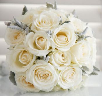


http://i-cdn.apartmenttherapy.com/uimages/chicago/013108whitekitchent.jpg

Monday, June 3, 2013
The Elements of Design
1. Line
A line is a form with width and length, but no depth. Line can be considered in two ways. Horizontal lines are calm and quiet whereas vertical lines suggest more of a potential for movement.

2. Shape
Shape is an area that is contained within implied line, or is seen and identified because of color or value changes. Shapes have two dimensions, length and width, and can be geometric or free-form.

3. Direction
All lines have direction - Horizontal, Vertical or Oblique. Horizontal suggests calmness, stability and tranquillity. Vertical gives a feeling of balance, formality and alertness. Oblique suggests movement and action

4. Size
Size is simply the relationship of the area occupied by one shape to that of another.

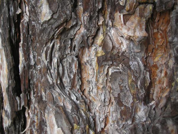
5. Texture
Texture refers to the surface quality, both simulated and actual, of artwork. Examples of texture could be rough, smooth, soft hard glossy

6. Color
Color is also called hue. It is divided into three properties, which are primary, secondary and tertiary colors.

7. Value
Value is the relative degree of lightness and darkness in a design element. It is also called tone.

References:
http://www.johnlovett.com/test.htm
http://www.educ.kent.edu/community/vlo/design/elements/value/blue.gif

http://www.fivecornersrealestate.com/wp-content/uploads/2013/04/colors.jpg

http://images.fineartamerica.com/images-medium/tree-texture-slobodanka-grozdanic.jpg
http://www.edb.utexas.edu/minliu/multimedia/PDFfolder/DESIGN~1.PDF
https://si0.twimg.com/profile_images/1774062082/Line_Logo.jpg

http://www.sweetcounter.co.uk/images/products/large-look-and-learn-window-shapesr1l.jpg

http://upload.wikimedia.org/wikipedia/commons/8/81/Draw-2-black-lines.svg

http://www.guidancecom.com/alphabet/linedir.gif

https://blogger.googleusercontent.com/img/b/R29vZ2xl/AVvXsEhWt7gzNMMvNExLW8IsKcO1yZ-_J138zYdj-9vmC9oytXPp98usnStEJMrMwmQ3nXpwRp53CbPnmiQ7X8CfSx1SzNNYGelXUCPyXWDIAeWMZmXf0yyWql-q8-GdE5PAuwXgaJR8dXpc9uw/s1600/Pinked+Circles.tiff
Principles of Design
1. Balance
Balance is the concept of visual equilibrium. It is similar to the balance in physics. Basically we can achieve balance in two ways: symmetrically and asymmetrically.
 Symmetrical balance can be described as having equal "weight" on equal sides of a centrally placed fulcrum. It may also be referred to as formal balance.
Asymmetrical balance, also called informal balance, is more complex and difficult to envisage. It involves placement of objects in a way that will allow objects of varying visual weight to balance one another around a fulcrum point.
 2. Gradation
Gradation of size and direction produce linear perspective.
Gradation of color from warm to cool and tone from dark to light produce aerial perspective.
Gradation can add interest and movement to a shape. A gradation from dark to light will cause the eye to move along a shape.
 3. Repetition
Repetition works with pattern to make the work of art seem active.
The repetition of elements of design creates unity within the work of art.
Repetition with variation makes the design look more interesting where as repetition without variation can become monotonous.

4. Contrast
Contrast is the juxtaposition of opposing elements
For example:
(a) Opposite colours on the colour wheel - red / green, blue / orange
(b) Contrast in tone or value - light / dark.
(c) Contrast in direction - horizontal / vertical.

5. Harmony
Harmony in the design principles is the visually satisfying effect of combining related, similar elements together.
For example, it could be similar colors or similar shapes.

6. Unity
The feeling of harmony between all parts of the work of art, which creates a sense of completeness.
 7. Dominance
Dominance gives a painting interest, counteracting confusion and monotony.
It can be applied to one or more of the elements to give emphasis
Look at the example on the right hand side, the red stands out from the black background where it shows emphasis on the red circle.
References:
http://www.google.com.my/imgresum=1&hl=en&biw=1024&bih=634&tbm=isch&tbnid=oHW4Rjh6rR6MVM:&imgrefurl=http://www.artrift.com/photo/99/dominance/&docid=BFLRGQXau7ZqJM&imgurl=http://
www.artrift.com/file/pic/photo/2011/01/Cooper-dominance-new-png_1024.png&w=551&h=553&ei=zT-sUb3AF4eBrgeW9oHICw&zoom=1&ved=1t:3588,r:0,s:0,i:156&iact=rc&dur=737&page=1&tbnh=175&tbnw=187&start=0&ndsp=16&tx=102&ty=84
http://www.getty.edu/education/teachers/building_lessons/principles_design.pdf
http://cdn.designfestival.com/files/2011/07/unity-among-the-monkeys.jpeg
http://www.johnlovett.com/test.htm
http://char.txa.cornell.edu/language/principl/principl.htm
http://visscom.files.wordpress.com/2013/04/repetition.jpg
https://blogger.googleusercontent.com/img/b/R29vZ2xl/AVvXsEgIYVsPp4HM_xic8UnkNE6_NL-EI1CmPuB-vCVYt9cTrq9Qy6IwbG50dObuoNdamNvCS12-f3rI5iXlRZSX_B0OIcW03s-YurXI94-NnVsxe3y1H1YlYCUWyZxv1pVhMpAvGNcBlju3Ll0/s1600/Contrast3.jpg
http://a1.s6img.com/cdn/box_006/post_16/913857_5823189_lz.jpg
Saturday, June 1, 2013
Abstract
In our first Adobe Photoshop lesson, the first exercise that our lecturer gave to us was to draw something ABSTRACT. Abstract can be defined as something that is existing in thought or as an idea but not having physical or concrete existence. We had learnt a few basic skills on how to use Adobe Photoshop such as brush, gradient, smudge, elliptical marquee tool and lasso tool.

So here it is! My first abstract design. I used black, grey and white as my basic colors because i wanted to create a moody and emotional feel. On the left hand side was the seahorses and i used smudge tool to create swirls so it felt like it is in the water and also to make my drawings smoother.
Finally, what i really feel about my design is that it portraits the darker side of the underwater world, where the sea creatures are not as beautiful as what we thought. The darker side of the underwater world can be lonely, sad or even competitive as the resources are getting lesser and lesser each day where the sea creatures are fighting with each other for food to survive. Besides, the dark side can be also described as group distinction as every type of sea creature only move in their own group. They do not mix together like how the cartoon we watched when we were young where the Nemo can be friends with other type of fishes in the sea and so on.
That's all about it for this post! :)
Carmen Too
Subscribe to:
Posts (Atom)